
Exploring Color Theory
Color theory is an essential aspect of graphic design that can significantly influence how a design is perceived. Understanding the fundamentals of color can elevate your projects and enhance the emotional response of your audience. In this article, we will dive into the essentials of color theory and explore its impact on graphic design.
What is Color Theory?
Color theory is a set of principles used to understand how colors interact with each other and how they can be combined to create visually appealing designs. It encompasses the color wheel, color harmony, and the psychological effects of colors. By mastering these concepts, designers can create more effective and engaging visuals.
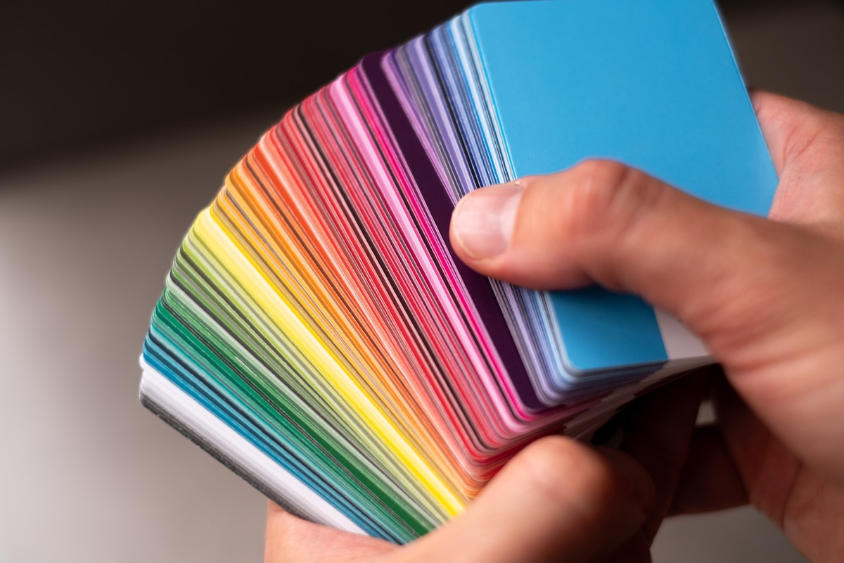
The Color Wheel
The color wheel is a circular diagram that represents the relationships between colors. It is divided into primary, secondary, and tertiary colors:
- Primary Colors: Red, blue, and yellow. These colors cannot be created by mixing other colors.
- Secondary Colors: Green, orange, and purple. These are formed by mixing two primary colors.
- Tertiary Colors: These are created by mixing a primary color with a secondary color (e.g., red-orange, yellow-green).
Understanding the color wheel is crucial for creating color palettes that are visually appealing and harmonious.
Color Harmonies
Color harmony refers to the pleasing arrangement of colors in a design. There are several types of color harmonies that designers can use:
- Complementary: Combines colors that are opposite each other on the color wheel (e.g., blue and orange). This creates a high contrast and vibrant look.
- Analogous: Uses colors that are next to each other on the wheel (e.g., blue, blue-green, green). This creates a serene and comfortable design.
- Triadic: Involves three colors that are evenly spaced around the wheel (e.g., red, yellow, blue). This provides a balanced and dynamic composition.
- Monochromatic: Uses variations in lightness and saturation of a single color. This creates a cohesive and harmonious look.
Choosing the right color harmony can greatly impact the mood and effectiveness of your design.
The Psychological Effects of Color
Colors evoke emotions and can influence behavior. Understanding the psychological effects of colors is crucial for graphic designers. Here are some common associations:
- Red: Passion, energy, urgency.
- Blue: Trust, calmness, professionalism.
- Green: Nature, growth, health.
- Yellow: Happiness, optimism, attention-grabbing.
- Purple: Creativity, luxury, wisdom.
- Black: Elegance, power, sophistication.
- White: Purity, simplicity, cleanliness.
By choosing colors that align with the message you want to convey, you can create a more impactful design.
Applying Color Theory in Graphic Design
Now that we understand the basics of color theory, let’s explore how to apply these concepts in graphic design:
Creating Effective Color Palettes
When creating a color palette, consider the following steps:
- Define Your Purpose: Understand the message you want to convey and the emotions you want to evoke.
- Choose a Base Color: Select a primary color that aligns with your brand or message.
- Build Around It: Use the color wheel to find complementary, analogous, or triadic colors that harmonize with your base color.
- Test and Iterate: Experiment with different shades and combinations to find the most effective palette.
Utilizing Contrast and Readability
Contrast is crucial for ensuring readability and drawing attention to important elements. Here are some tips:
- High Contrast: Use contrasting colors for text and background to improve legibility.
- Consider Color Blindness: Ensure that your design is accessible by avoiding color combinations that may be difficult for color-blind individuals to distinguish.
- Limit Color Usage: Too many colors can create confusion. Stick to a well-defined color palette to maintain clarity.
Conclusion
Color theory is a powerful tool in graphic design that can significantly impact how your work is perceived. By understanding the color wheel, color harmonies, and the psychological effects of colors, you can create designs that resonate with your audience. Whether you are designing a logo, website, or marketing materials, applying these principles will help you elevate your projects and communicate your message effectively.
Start experimenting with color theory in your next design project, and watch how your understanding of colors transforms your work!